Sunday, 6 January 2019

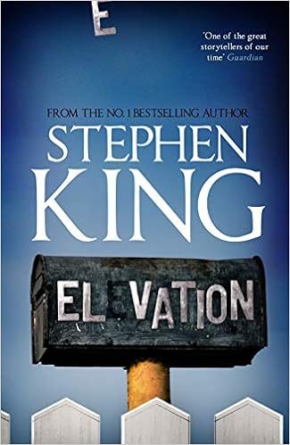
ELEVATION by Stephen King

elevation by stephen kingWe have reached the point where anything that Stephen King writes will be published. I generally don't have a problem with that, but this 'novella' is a thin tome with what looks suspiciously like double spacing. If it took me two hours to read then I'm surprised.

It also felt like some reheated old ideas thrown together. The central conceit of Thinner was a man who got thinner no matter what he did. The central conceit here is that a man is getting lighter no matter what he does. Gravity is losing its hold. Does this cause anyone great concern? No not really.

The main concern is that there's a married lesbian couple running a restaurant and people don't approve. The local seasonal running race should take care of that. Really? In Trump's America, one photograph is all it takes to change conservative views?

It is a slight tale that doesn't last long or think deep, both of which are surprising for King.

That said, the man does know how to write and you breeze through it pleasurably enough, though by the end of the this snack you're left far from satisfied.

Sunday, 25 March 2018

BUFFY THE VAMPIRE SLAYER FAQ


We've been a bit sniffy in the past about the FAQ books because they don't answer frequently asked questions and they don't address the subtitle of "everything that's left to know" about their subjects, but it's time to just accept that this is the marketing line and nothing is going to change that.

So here it is, the latest potted history of Buffy the Vampire Slayer, one of television's finest fantasy shows, with chapters on the major characters, each season's plots, the 'big bads', the spin off show ANGEL and more. 

It's written by people who clearly know the show and clearly love the show and contains interviews new and old, but it is not (as has been the case with the other books in the series that we have seen) revelatory. There is little here that the hardcore fan won't already know and the there is too much here for anyone who is going into the show for the first time. There are spoilers indeed here.

That said, the book succeeds in its primary function, which is to remind you just how wonderful BUFFY VAMPIRE SLAYER was and, after reading it, you'll be bringing down those DVDs and plunging back into the world of the Slayerettes once again.

Monday, 11 December 2017

NORRIS GOES WEST is released on Amazon

NORRIS GOES WEST, the sequel to SPENSER GOES NORTH has just been released onto Amazon sites around the world for anyone with one of those Kindle reading thingies to enjoy (or not, their choice). 

The street urchin of that first book takes centre stage this time as he investigates missing children on the streets of Liverpool and ends up in an adventure that will uncover a deadly threat to the British Imperial Commonwealth.

Yes, another one.

He'll find his street smarts tested, his courage stretched and his horizons forcibly expanded, but he will also face his greatest challenge yet - girls.

The hardback will be available on lulu.com as soon as I can get it formatted for that and checked.

Friday, 3 November 2017

The Art of Horror - An illustrated history


Of all the genres of movies there are, none has produced movie posters that are as colourful and lurid as those created to sell the humble horror movie. In fact, the more humble the horror movie, the more lurid the cover. Some of history's greatest movie posters are reprinted in this sumptuous coffee table book that spans from the earliest silents right through to Resident Evils and Underworlds that were around and about at the cinema in recent times.

Considering the length of the publishing process, no book can ever hope to be completely up to date, but considering that the art of the movie poster is dying on its feet with the advent of photoshop and video screen advertising, this may the last book to celebrate the art of the nasty poster for nasty movies.


It's not just filled with posters for the likes of Nosferatu, The Curse of the Werewolf and (ahem) The Human Centipede, there are some original pieces that celebrate the likes of The Masque of the Red Death, The Mummy and Pan's Labyrinth.

There are words as well, though they rarely amount to half the page and don't really tell any hardcore horror or movie poster fan anything that they didn't already know about or didn't really need to know about. The words, though, are not what books like this are about. The pictures are the thing and it's unlikely that you're going to find a more comprehensive and visually appealing collection of horror movie poster art anywhere.

Horror art is always going to be something of an acquired taste and certainly this book's audience is going to be limited by the subject matter, but if you've acquired that taste then there is plenty here to enjoy.

So, with Halloween just over and Christmas on the horizon, treat the gore-lover in your life to this hefty tome of bright, black and red-drenched cinematic horror delights, the like of which we are unlikely to see again.


Sunday, 4 December 2016

AN ORC LIKE BALREK is released onto Amazon Kindle.

I am finally able to announce the arrival of the sequel to one of my earliest books, An Orc Not Like Others.

An Orc Like Balrek picks up sometime after the previous book and continues the story, catching up with old characters and introducing some new ones. The blurb goes something like this

"Balrek is not like other orcs.

For one thing, he is now the ruler of an entire City-kingdom, something that has not endeared him to many people of power and led to regular assassination attempts.

All of which makes securing his legacy and creating the first orc homeland all the more difficult.

And that was before what happened at the theatre.

This return to the City-kingdoms of An Orc Not Like Others brings together characters old and new to continue the story of the orc who truly is different from others."

This sequel has genuinely been decades in the making since it has been the back of my mind since the first one was written, though it is hardly the sequel that I had in mind way back then.

It's still a fantasy novel, it still has its tongue lodged in its cheek at times and still contains scenes of gratuitous orcery.

No orcs were hurt in the writing of this book (which really annoyed most of them).

Sunday, 17 January 2016

Game of Thrones Journals - the second coming

So, you're innocently going about your business when you are struck by the greatest story idea ever (TM). You know that you're never going to remember it, so you reach into your backpack/ briefcase/ handbag (delete as appropriate), whip out your pen and your trusty journal and jot it down.

That's what should happen, but let's be honest, what really happens is you scrabble around looking for anything that you can write with and write on. Well, one of those problems has been solved with style with the arrival of these new Game of Thrones journals.

The first four in the series were embossed with the crests of the Great Houses, but this second set has gone for other symbols that are hugely important in the world of Westeros in George RR Martin's fantasy behemoth. The first is the Iron Throne, the thing that all the fuss is about and that everyone's fighting over in the first place. Next up is the seal of the King's Hand, bestowed on the most trusted advisor to the King and therefore making them the second most powerful person in the whole of the political mess. Following that is Night's Watch, denoted by the bulk of the giant wall that they defend against the Winter and the terrible things that it brings with them.  Last, but far from least, is Valar Morghulis, represented by the most famous white door in the whole of written fantasy.

That's all well and good, but a notebook's a notebook's a notebook I hear you say.

I don't hear you say that? I could have sworn I heard you say that. Well, these aren't your common or garden notebooks. The covers are not just attractively embossed in silver and gold (and yes, white) colour on faux leather jackets, but they come with inner covers bearing scenes from the show itself (Tyrion graces the Hand of the King insert whilst Arya turns up in the Valar Morghulis edition.

That's not enough, you cry. My, you are a demanding bunch aren't you? OK, so how about the fact that the paper is pretty good quality, thick and lined and not likely to bleed your ink through to the next page. How about the fact that the ribbon page marker comes as standard and an elastic band holds it shut when you're not frantically writing down your own thoughts and ideas that are so much better than that George RR Martin could ever come up with (if in fact he ever comes up with anything more anyway, since he doesn't seem to be all that on time.  Just to finalise the deal, there's a nifty little document pocket at the back for you to stash useful and interesting snippets for future reference.

 Suffice to say that they're just a bit classier than your usual 99p efforts from the newsagent and might be just the thing to inspire you to George RR Martin levels of success with the most famous fantasy series on the planet, the most successful TV show on the planet and a shedful of deadlines that you just don't seem to be able to get around to meeting.

Or you can just sit there running your hands lovingly over those oh so attractive covers crooning "Who's a pretty book then?" Your choice of course.


Tuesday, 31 March 2015

LONDON DARK cover is revealed

Now that the book is out with my trusty group of beta readers for the necessary grammar bashing and clumsy word structure identification, it is time to reveal the cover.

I've working on, and talking about, this book for so long, I've almost forgotten what life was like before I started it.

I wanted something that was simple and stark, using the words of the title to set the tone rather than using imagery. Since it's a horror book, there was plenty of scope for using blood and gore and all kinds of red images of the city to make a statement, but instead I wanted to go for something a little more mysterious.

I'm very pleased with the final outcome. I'm also quite pleased with the byline - The lights are out, but something's home. The use of red in the final word just takes the starkness off it a little. I did consider that 'something' should be in red, but that didn't look right somehow.

The blurb for the book isn't finished yet, but it's going to read something like this:

"The lights are out, but something's home.

A daring, co-ordinated act of eco-terrorism plunges London into darkness. As the night progresses, it becomes clear that there are reasons why the city is kept lit at all hours, reasons that have nothing to do with the night-time economy or the fight against crime.

There are good reasons to be afraid of the dark and tonight, in London, the darkness has teeth."


All comments are welcome and the book should be out sometime soon.